
Building an eLearning gamelet - Creating an engaging visual
With a clear scope, the creative concept agreed and work completed on a technical Proof-of-Concept to make sure that we can build the gamelet properly, the real fun starts with the Graphic Design stage! You can see the time-lapse of the Graphic Design build above.
Getting the basics right
In order to start designing, we needed a solid concept to work on. The team agreed on a simple pitfall style adventure game. An explorer travels through two worlds: a bright landscape of floating islands and a dark underworld cavern. In both, the Learner will have to answer questions to overcome the obstacles and keep as many brain points as possible. If the Learner is successful, they will find a glowing relic at the end of the cave that takes no small amount of inspiration from the Rosetta stone.
With the storyboard moving on, we began to assemble mood boards to map out what the character and environment could potentially look like. Drawing inspiration from these mood boards along with extra details sourced from the storyboard, we made some preliminary sketches to better visualise the theme for our gamelet. Things start to move a lot quicker once the visual goal for the gamelet is in place!


Designing a hero for the game
Every story needs a hero, so we got to work designing the explorer we follow through the two worlds. We decided on a sprite style character, nothing too anatomically complex. Hon, one of our development team, volunteered to be the model for their appearance…. which is not to brand them as short, and lacking anatomical complexity.

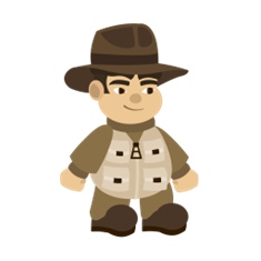
Once our explorer was kitted out in a nice utility vest and fedora, he was ready to be sent to work. Some simple animation put together in Adobe After Effects ensured he could run, jump and fall through the terrain once that was developed.
Giving our hero a place to explore
When designing the backgrounds, we sought to complement the narrative in an engaging way so that the gamelet is more fun and engaging for the Learner. The floating islands in our gamelet are in a world long forgotten, columns and temples left to ruin, which the cave appears to be once home to a long forgotten ancient civilisation. Although it can seem secondary to the learning content, we always find that a little thought on making a game interesting and/or fun goes a long way to supporting Learner engagement.


Staying ‘on-brand’
Organisations of every size invest a significant amount of time in their brand, so it is important to consider a client’s style guidelines. This is an important consideration in any piece of graphic design work. Colour is the easiest way to implement it. In this case, we had a selection of blues to work with. Adjustments were made so we could fit them in without compromising the environment. A good rule is to make sure that colour isn’t used just for the sake of it, and to give careful thought about how it complements the existing palette and environment.

Thank you for reading our content, and please feel free to share content if it is helpful to other people.
You can follow us on LinkedIn for regular updates and get in touch by email - team@konnektis.com, phone - +44 (0)330 043 0096, or with the Contact Form below if you would like to speak to one of the team.